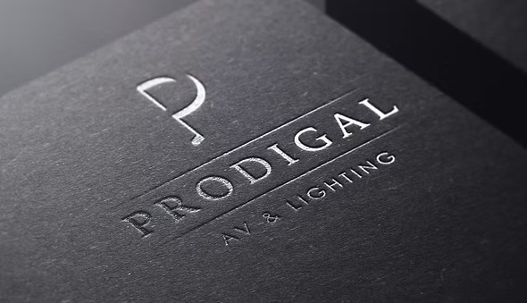
Prodigal AV needed a distinctive logo that would reflect their expertise in professional sound and lighting while establishing a modern, memorable identity. The aim was to create a brand that felt bold and professional, with a design that went beyond aesthetics by incorporating a meaningful concept that clients would remember.
We designed a bespoke logo centred around the letter P, transforming it into a unique brand mark through subtle yet purposeful details. Strategic cuts and shadow elements were incorporated to represent the world of stage lighting, while the serif of the P was refined into the shape of a musical note, symbolising the company’s expertise in professional audio. This combination of visual cues creates a logo with depth, meaning, and a story that reflects the services Prodigal AV provides, while remaining clean, modern, and highly versatile across digital and print.
The Results
The finished logo provides Prodigal AV with a distinctive visual identity that immediately communicates creativity, professionalism, and technical expertise. By embedding subtle references to both sound and lighting within the design, the brand has a unique talking point that sets it apart from competitors, creating a memorable identity that is both meaningful and instantly recognisable.
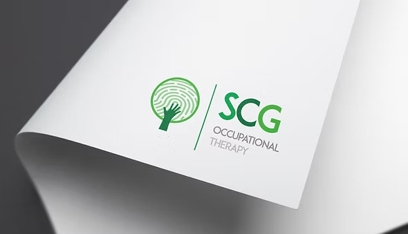
SCG Occupational Therapy needed a compassionate, meaningful brand identity that reflected the care and support they provide to children and individuals with autism, learning difficulties, and additional needs. They wanted a brand that would communicate trust, growth, and individuality while standing out within the healthcare sector.
We created a bespoke brand identity centred around a thoughtfully crafted logo that tells the story of the business. At its heart is a nurturing tree, symbolising growth, development, and the journey each individual takes through therapy. The tree itself is formed from a fingerprint, representing the uniqueness of every person and the personalised approach SCG Occupational Therapy provides. The flowing shape also subtly represents a helping hand, reinforcing the practice’s supportive and caring nature, while the surrounding circular form symbolises achieving goals, progress, and the ongoing support offered throughout each client’s journey. Alongside the logo, we developed a cohesive visual identity and brand guidelines to ensure the brand remained consistent across all future communications.
The Results
The finished brand gives SCG Occupational Therapy a distinctive and meaningful identity that reflects both its values and the positive impact it has on the lives of its clients. By combining thoughtful symbolism with a clean, professional design, the brand creates an immediate emotional connection, communicates trust and compassion, and provides a strong foundation for the organisation’s future growth and recognition.
Luxury Event Decor Wales required a sophisticated brand identity that reflected the premium nature of their event styling services. The goal was to create a timeless logo that would appeal to high-end clients while conveying elegance, luxury, and professionalism across both digital and printed applications.
We designed a refined, minimalist logo that embraces a clean typographic approach, allowing the brand name to take centre stage. Using an elegant font paired with a premium black and gold colour palette, we created a visual identity that feels luxurious, modern, and timeless. The simplicity of the design ensures versatility across signage, social media, stationery, vehicles, and event branding while maintaining a strong, recognisable presence.
The Results
The final identity gives Luxury Event Decor Wales a polished, premium brand that reflects the quality of their services and resonates with their target audience. The clean aesthetic, elegant typography, and luxury colour palette create an instantly recognisable brand that builds credibility and positions the business within the high-end events market.
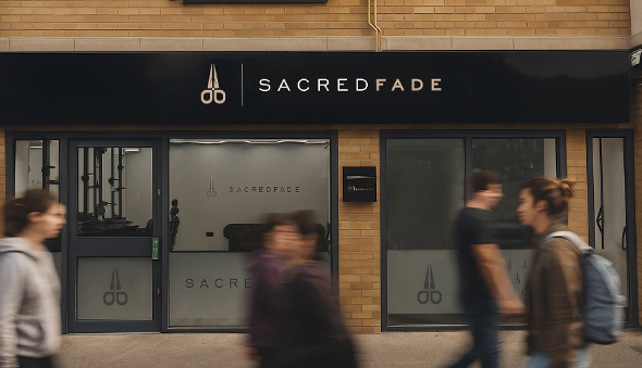
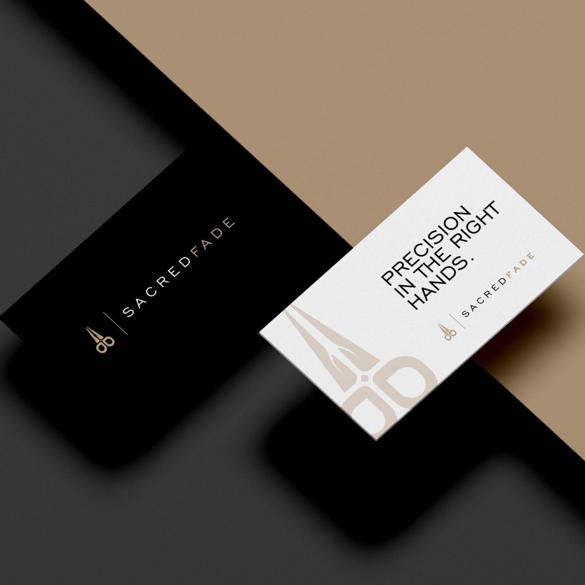
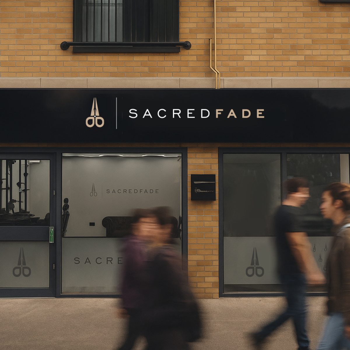
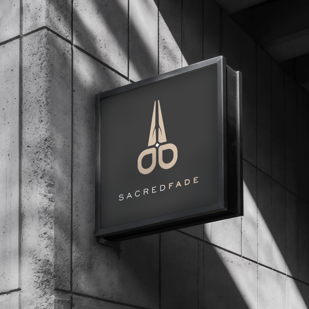
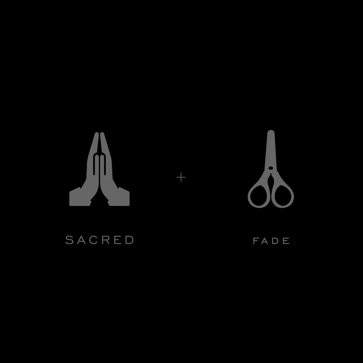
Sacred Fade approached us during the early stages of launching their new barbershop while the interior was still under construction. They needed a distinctive brand identity that would not only establish their presence within the local market but also guide the overall look and feel of the shop’s interior and future marketing.
We created a complete brand identity package, including a bespoke logo, carefully selected colour palette, typography, and comprehensive brand guidelines. The branding was designed to influence both the customer experience and the interior design, ensuring every touchpoint felt cohesive. We also designed the external signage, frosted window graphics, and a range of launch marketing materials, including flyers and posters, to support the grand opening.
The Results
Sacred Fade launched with a strong, cohesive brand that stood out from day one. By creating a consistent visual identity across the interior, exterior, and promotional materials, the business was able to make an immediate impact, build brand recognition, and establish a professional presence within the local community.
Wolfget Media required a distinctive brand identity that would position the company as a premium videography business while standing apart from competitors. The objective was to create a memorable logo and visual identity that not only reflected the company’s creative expertise but also told a story that clients could connect with.
We developed a bespoke brand identity centred around a unique logo concept that combines the silhouette of a wolf’s head with the letters W and M, representing Wolfget Media. This subtle integration creates a hidden visual narrative, giving the brand a memorable talking point while maintaining a clean, modern aesthetic. Alongside the logo, we created a refined visual identity and comprehensive brand guidelines, ensuring consistency across every application and providing a strong foundation for future marketing and business growth.
The Results
Wolfget Media launched with a bold, premium brand that is instantly recognisable and rich in meaning. By combining symbolism with strategic design, the identity gives the business a unique story to share with clients, helping differentiate the brand in a competitive creative industry while creating a memorable and professional first impression.
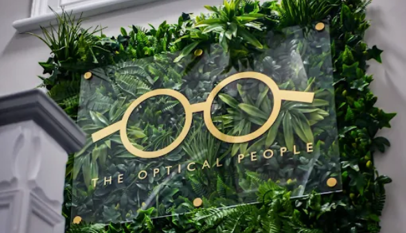
The Optical People wanted to elevate their social media presence with high-quality, engaging content that reflected the professionalism of their practice. Their goal was to create a stronger, more cohesive online identity, increase engagement, and effectively showcase both their expertise and premium eyewear collections through strategic digital marketing.
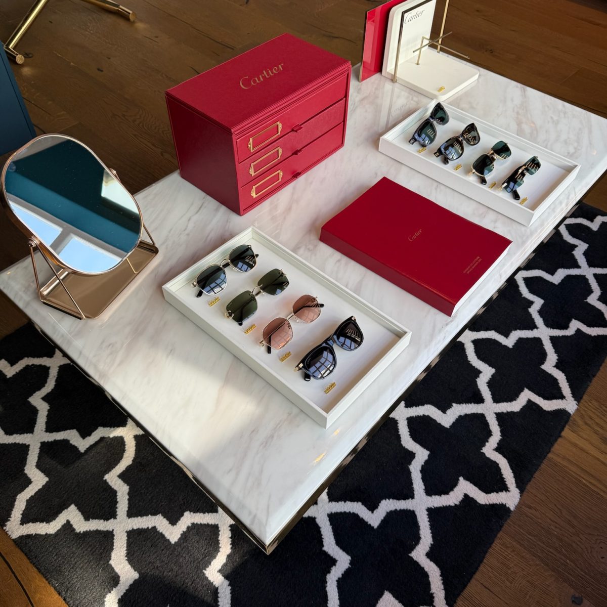
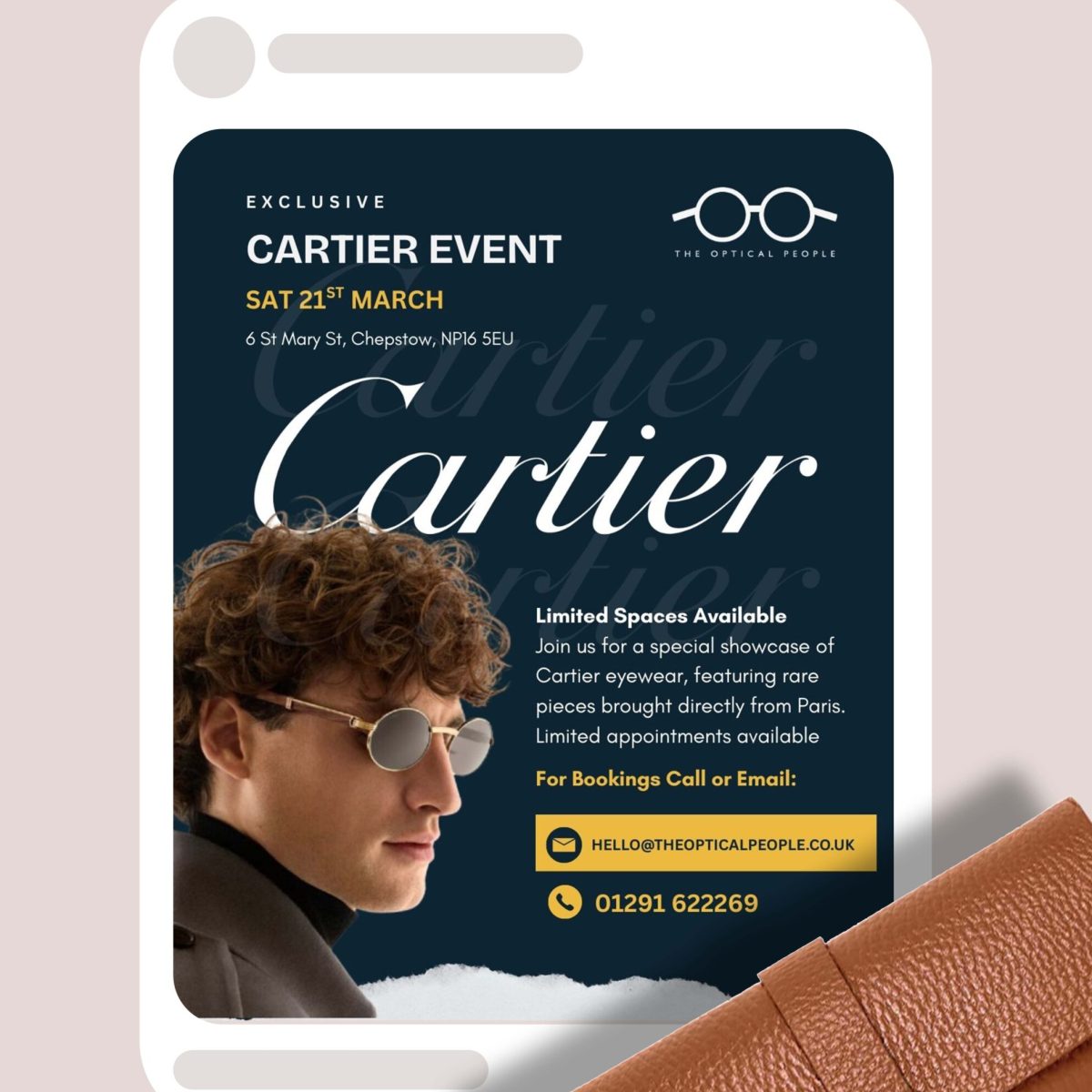
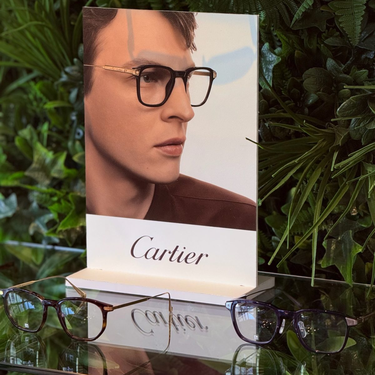
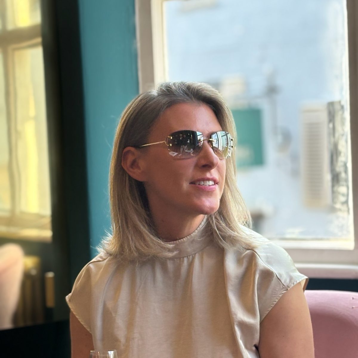
Over a three-month period, we managed the practice’s social media strategy, producing and scheduling engaging content across their platforms. We carried out on-site photography and videography, professionally edited all content, and maintained a consistent publishing schedule. We refreshed their social media branding by redesigning the profile image using a refined logo mark and creating a bespoke set of branded Instagram Story highlight icons for a cleaner, more premium appearance. We also created and configured a Linktree, giving customers quick access to appointment booking, key services, contact information, and other important links directly from their social profiles. As part of the partnership, we supported their exclusive Cartier Showcase Day by capturing premium photography and cinematic video content that showcased the latest Cartier eyewear collection, helping maximise the event’s reach and engagement across social media.
The Results
The Optical People gained a polished and cohesive digital presence that better reflected the premium experience offered within the practice. Through consistent content creation, strategic social media management, improved customer journeys via Linktree, and the successful promotion of their Cartier Showcase Day, the practice strengthened its online brand, increased audience engagement, and created a library of high-quality content to support future marketing campaigns.
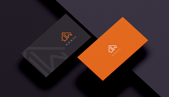
JW Homes approached us to create a professional and trustworthy brand that would reflect the high standards of their estate agency. As a new business, they needed a cohesive visual identity that would build credibility from day one and create a consistent presence across both their office and customer communications.
We developed a complete brand identity, including a bespoke logo, carefully curated colour palette, typography, and comprehensive brand guidelines. To ensure consistency across every touchpoint, we designed premium business cards, professional email signatures, external and internal signage, and promotional banners. Every asset was created to reinforce the brand and deliver a polished, recognisable identity both in person and online.
The Results
JW Homes launched with a strong, professional brand that immediately established trust within the local property market. The consistent branding across their office, printed materials, and digital communications created a memorable customer experience, helping position the business as a credible and modern estate agency from the outset.
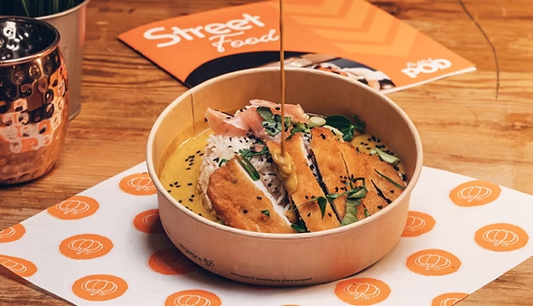
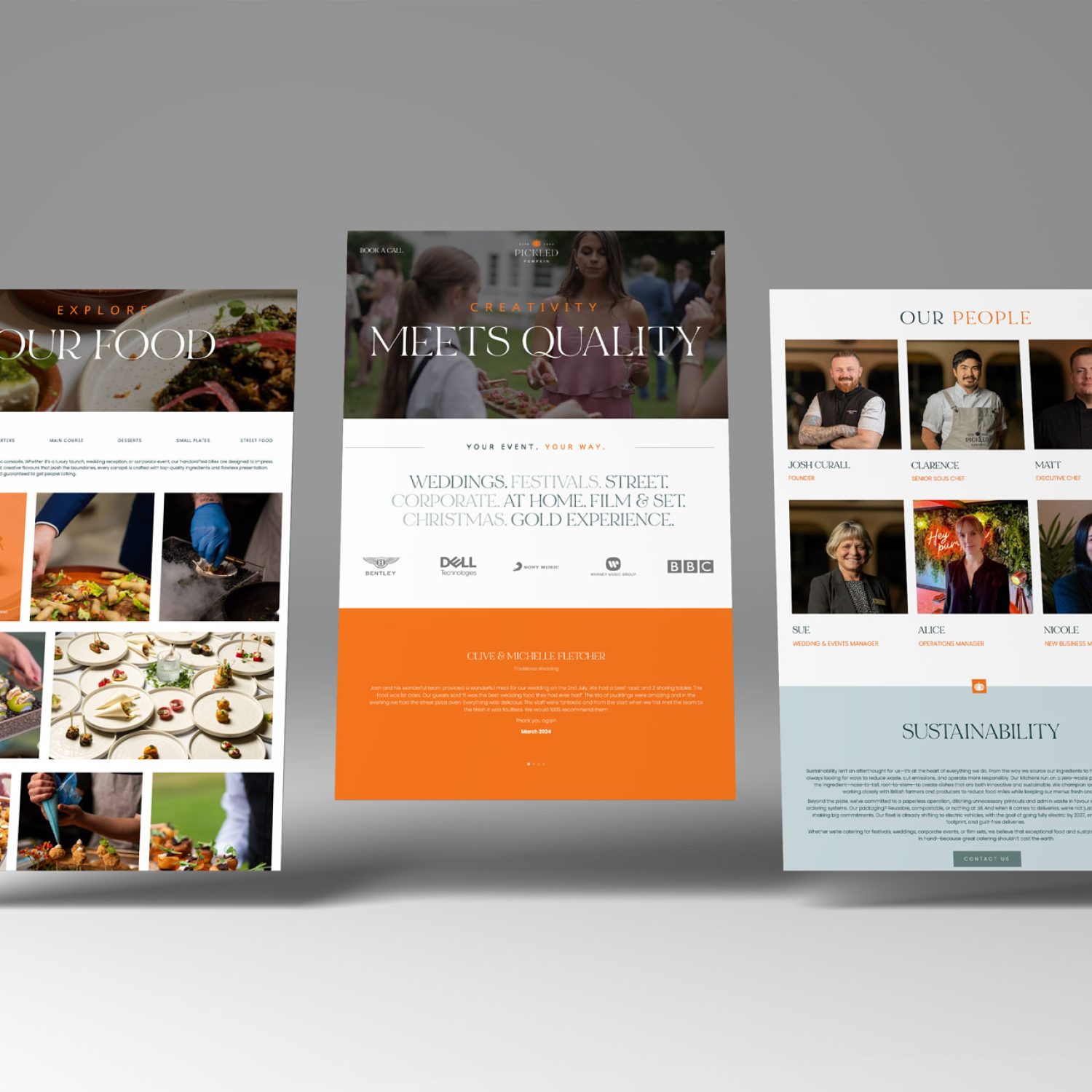
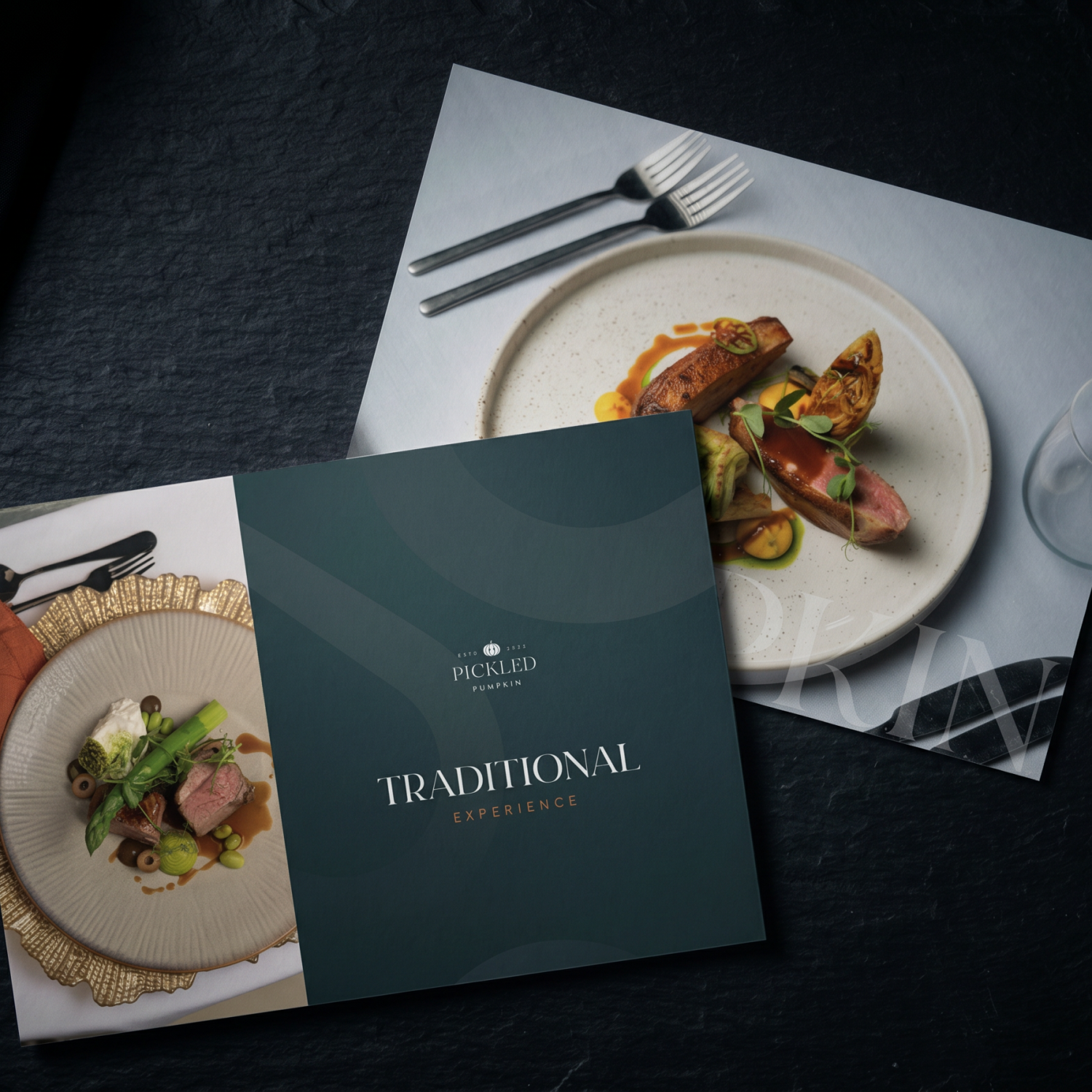
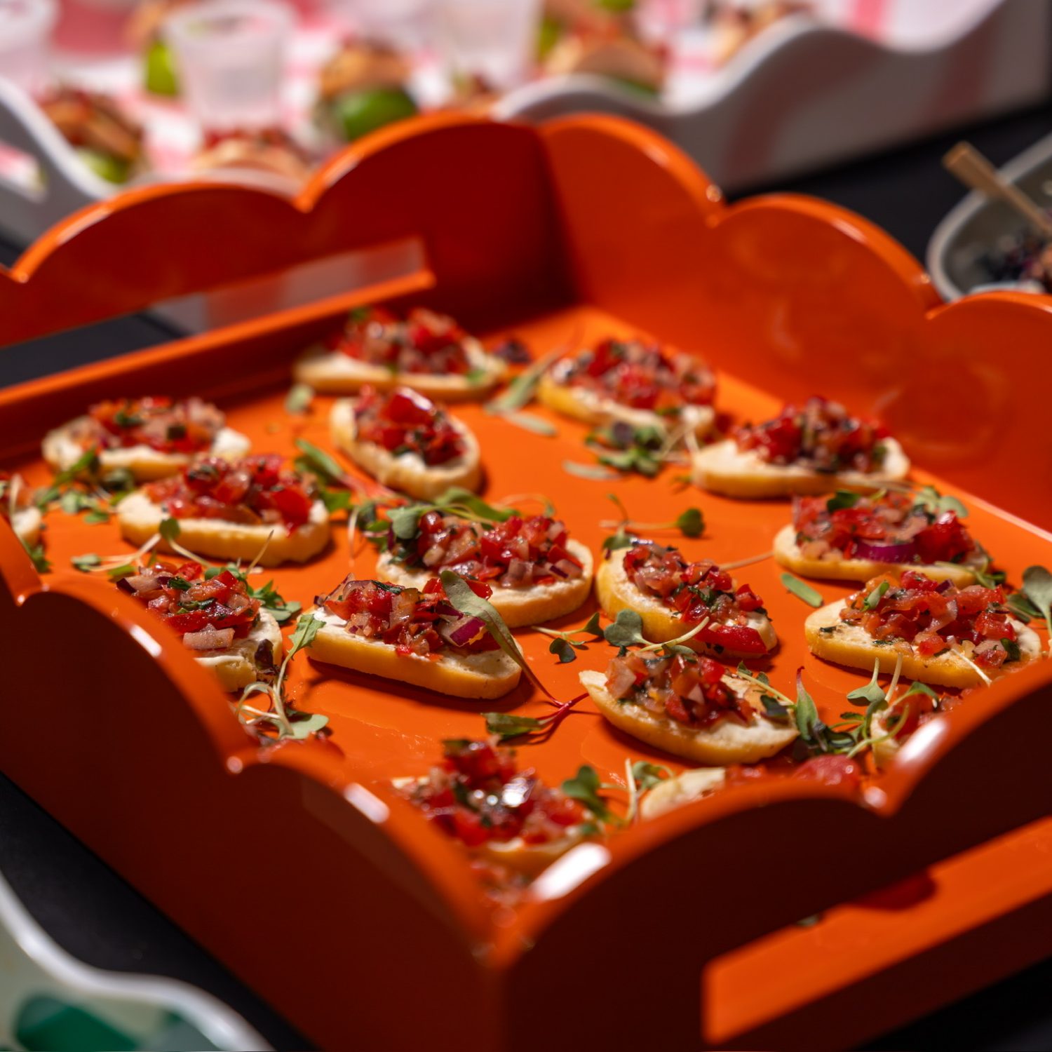
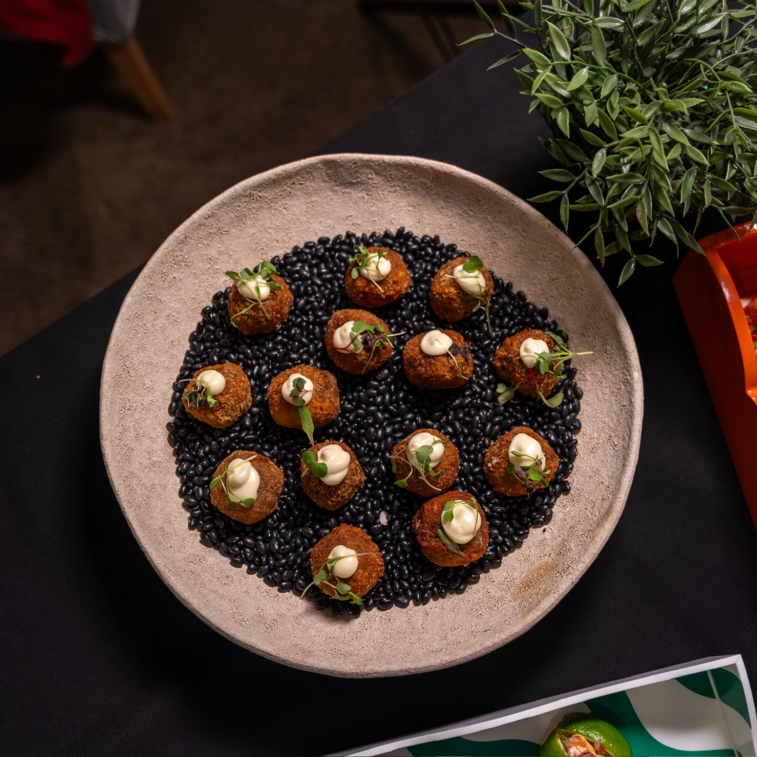
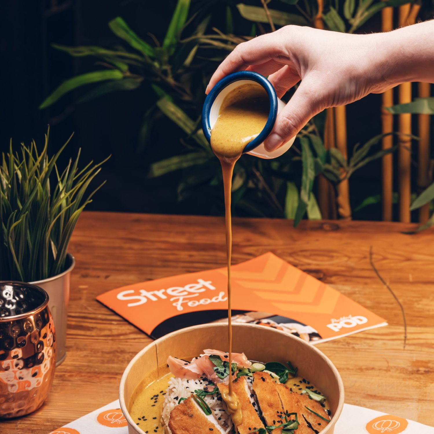
Pickled Pumpkin Catering wanted to establish themselves as a premium catering brand with a distinctive identity that reflected the quality of their food and exceptional service. They needed more than just a logo—they required a complete brand ecosystem that would create consistency across every customer touchpoint while supporting the growth of the business through effective digital marketing and brand awareness.
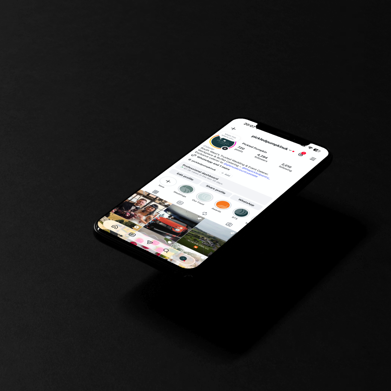
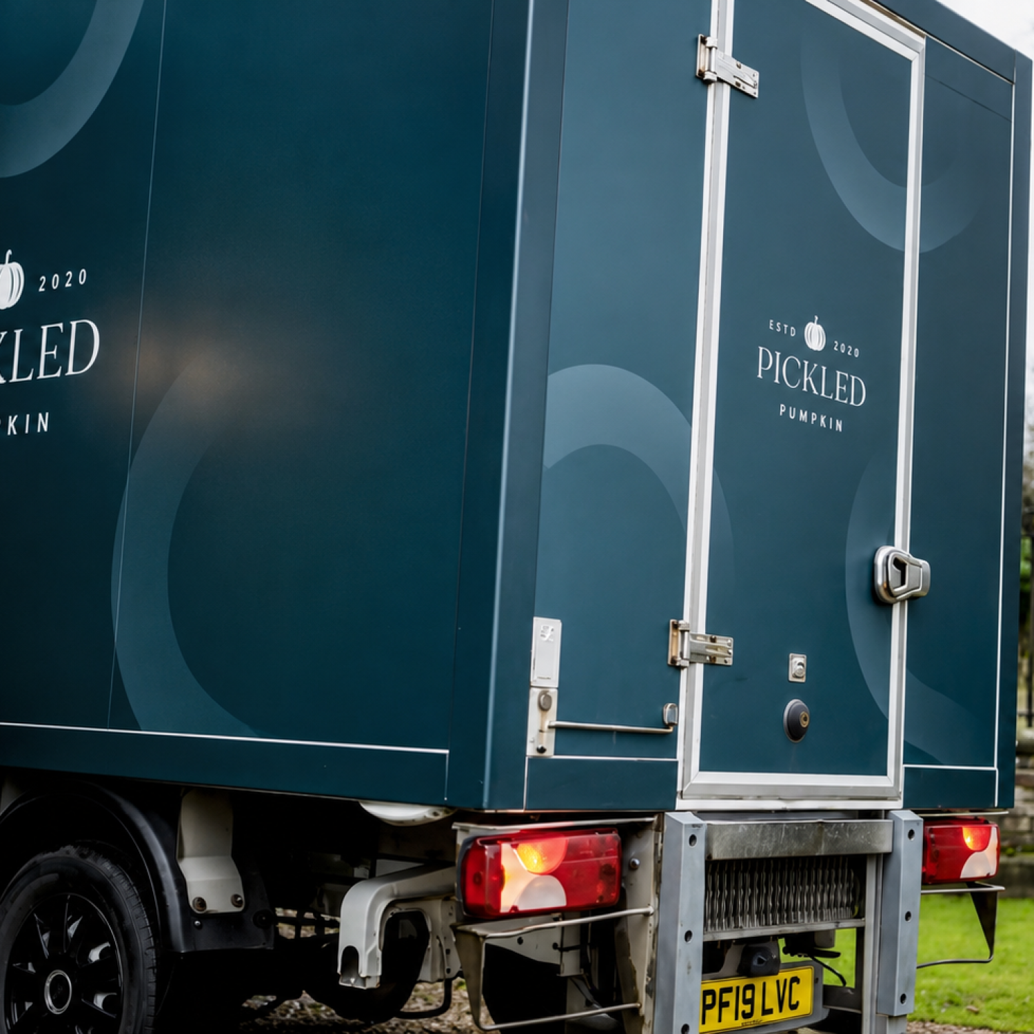
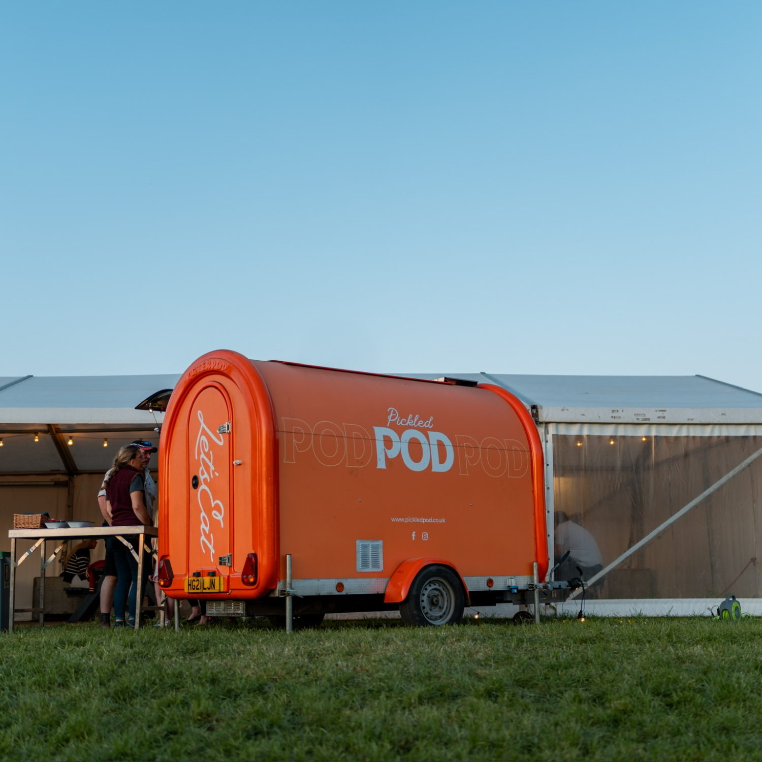
We delivered a full branding and marketing solution, beginning with the creation of a bespoke visual identity and comprehensive brand guidelines. We designed and built a user-focused website, produced ongoing social media content, managed professional photography and video shoots, and handled content scheduling across their platforms. To drive enquiries, we developed and managed targeted Meta advertising campaigns, helping the brand reach new audiences and generate qualified leads. We also designed vehicle wraps, external signage, brochures, email signatures, and a wide range of printed and digital marketing materials, ensuring every interaction with the brand remained consistent and impactful.
The Results
The result is a strong, recognisable brand with a premium presence across both digital and physical channels. Through strategic branding, engaging content, targeted Meta advertising, and consistent marketing assets, Pickled Pumpkin has significantly strengthened its visibility, increased customer enquiries, and established itself as one of the region’s leading premium catering companies.
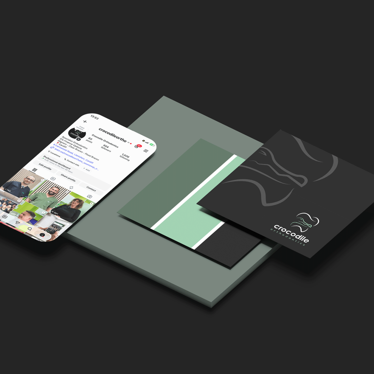
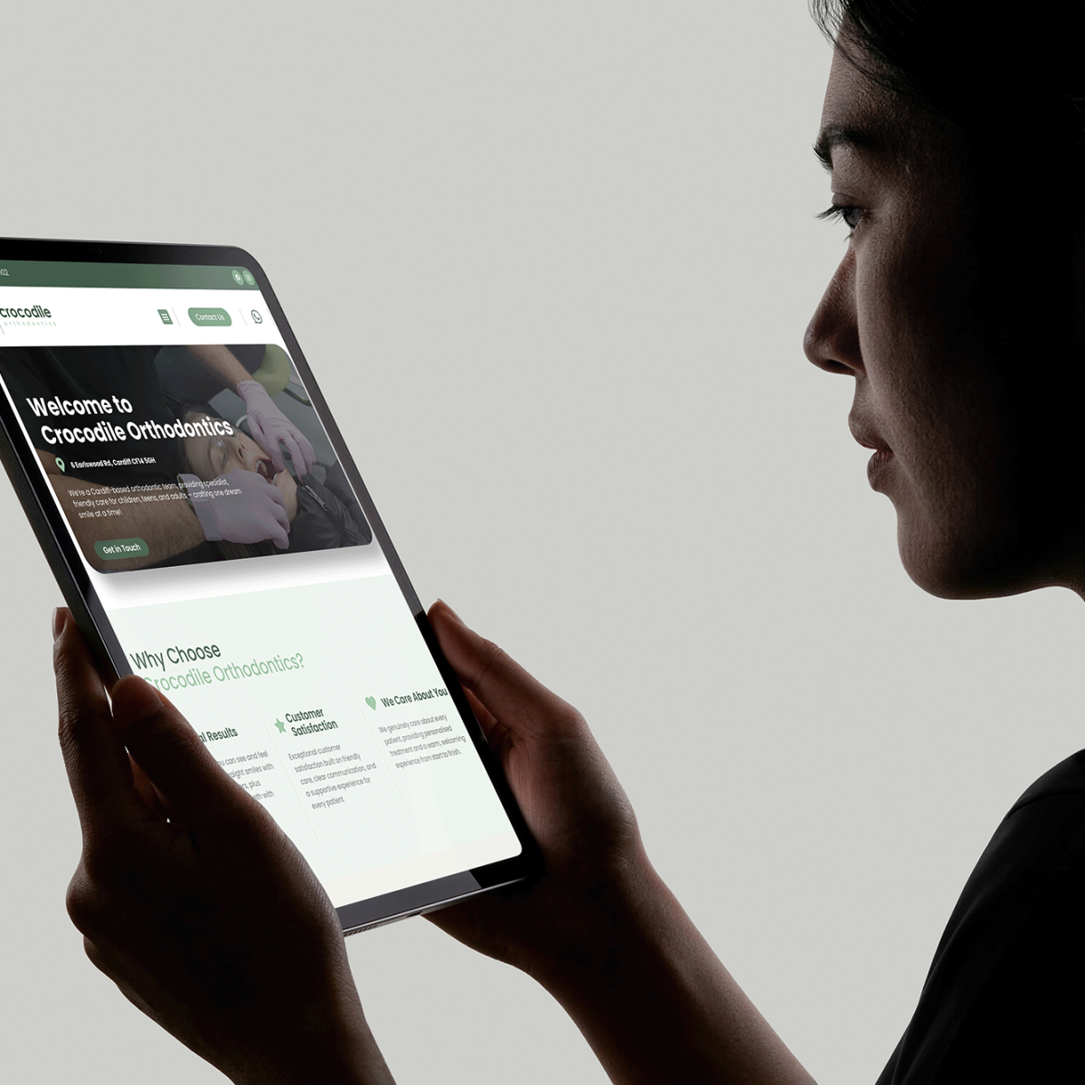
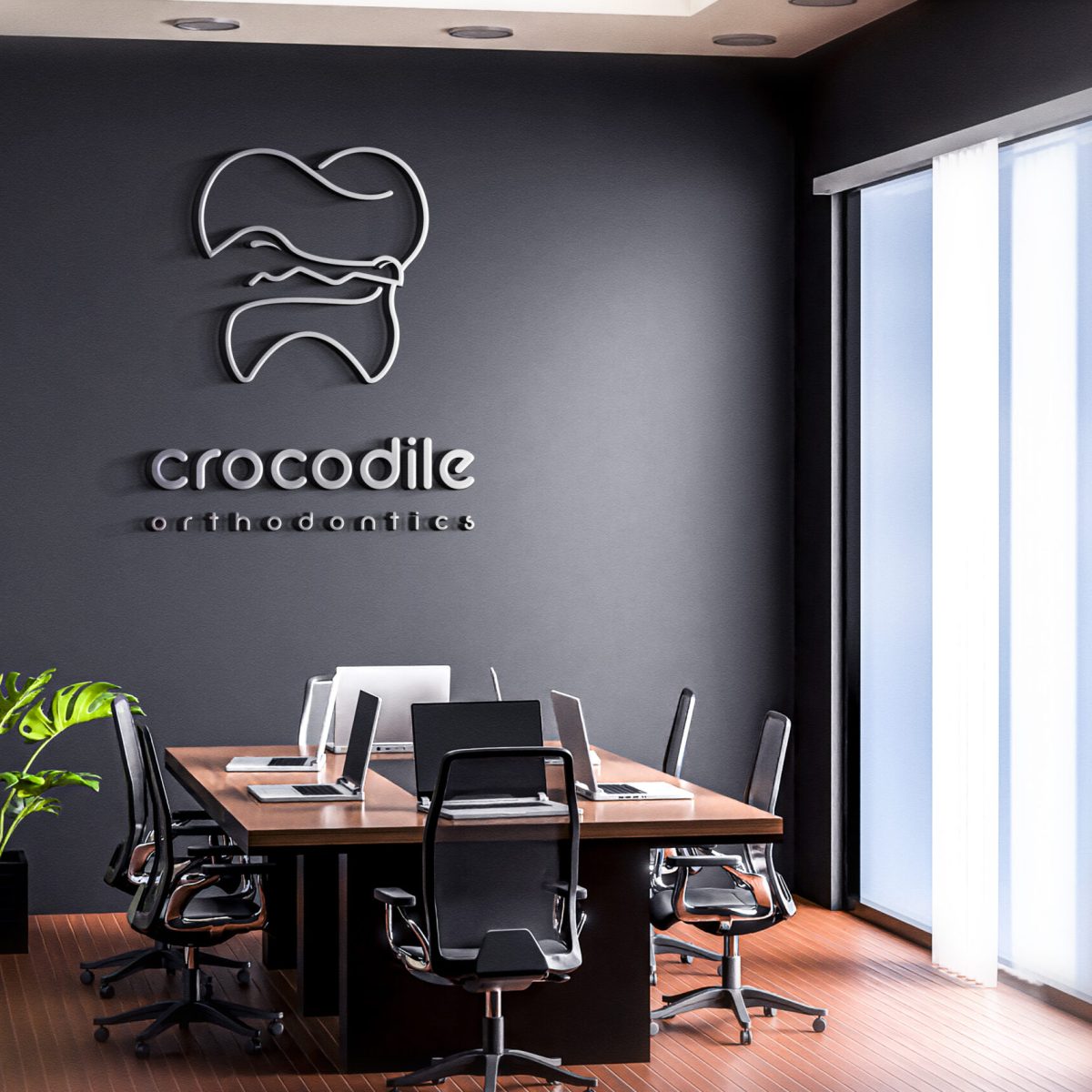
Crocodile Orthodontics required a complete brand refresh to establish a modern, approachable identity that reflected the quality of their patient care. Alongside developing their visual brand, they needed a high-performing website that would increase enquiries, improve the user experience, and support the launch of the practice across digital channels.
We developed a complete brand identity, including a bespoke logo, comprehensive brand guidelines, and a refined visual style to ensure consistency across every touchpoint. We designed and optimised a responsive website focused on performance, user experience, and lead generation, alongside producing engaging social media content to support the website launch. To elevate the digital experience, we also created a homepage video banner that immediately communicates the practice’s professionalism and welcoming atmosphere.
The Results
The final result is a polished and professional brand identity that reflects the quality and care provided by Crocodile Orthodontics. The clean and modern design ensures the brand stands out while maintaining a calm and trustworthy presence. The cohesive branding works effectively across the website, social media, and marketing materials, helping the practice establish a strong and recognisable identity. The improved digital presence allows patients to easily access information and feel confident in choosing their services.
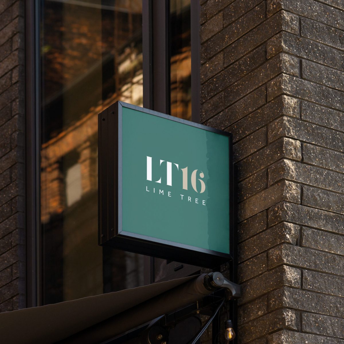
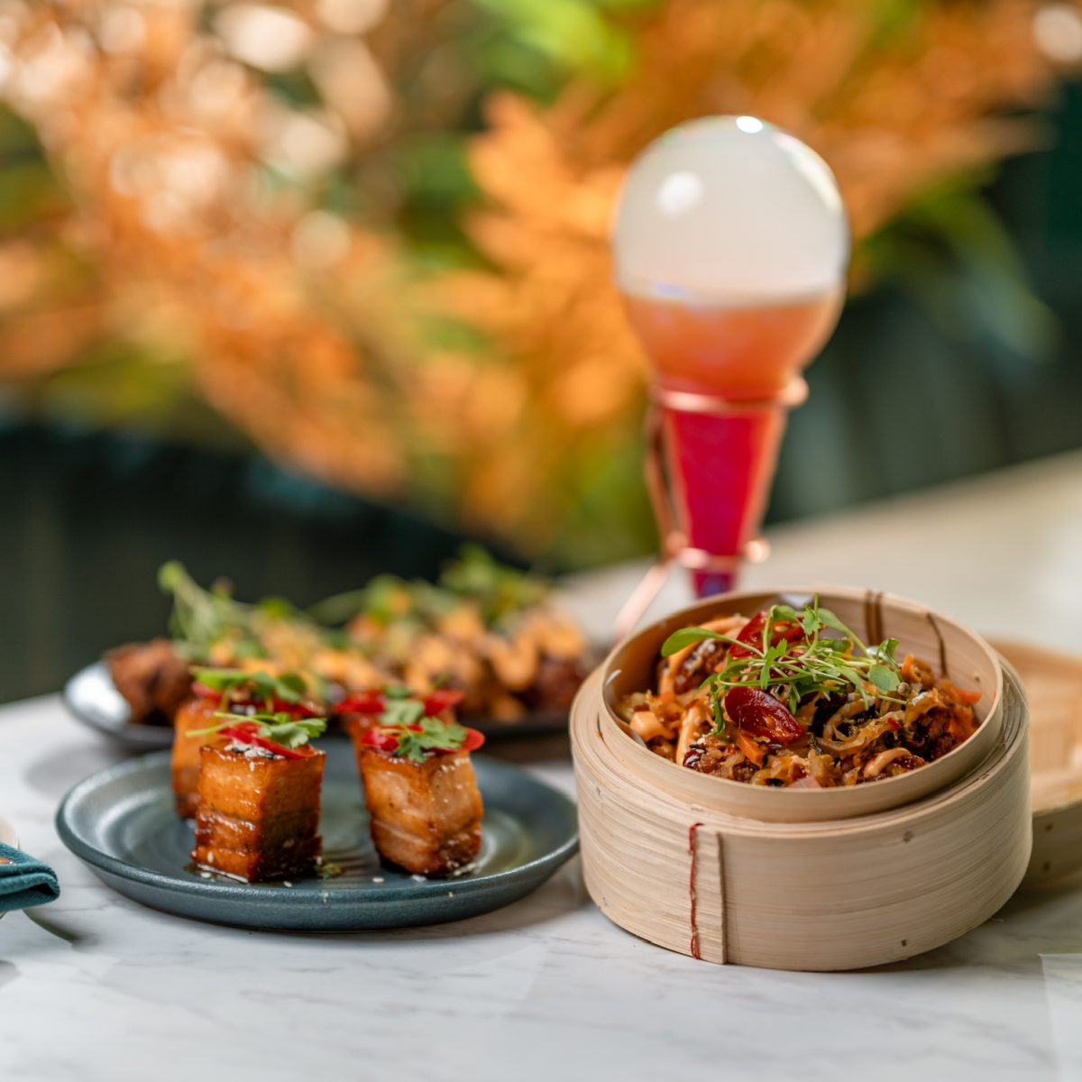
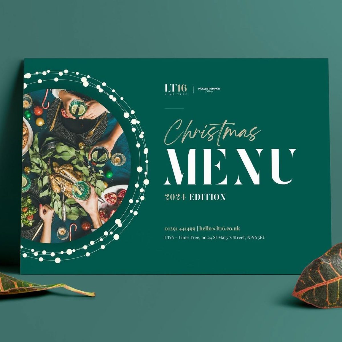
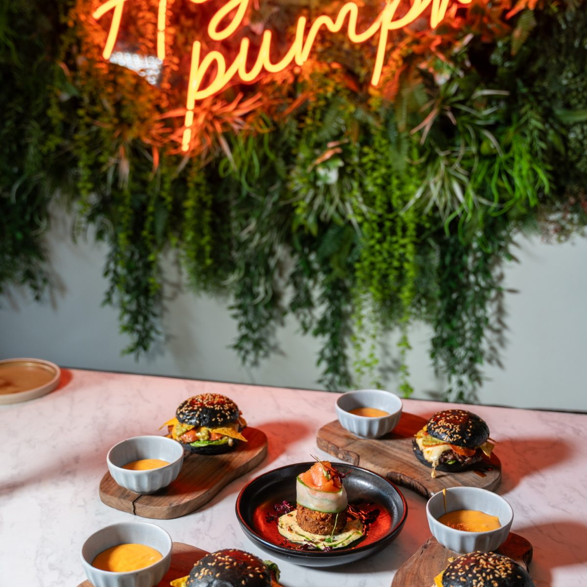
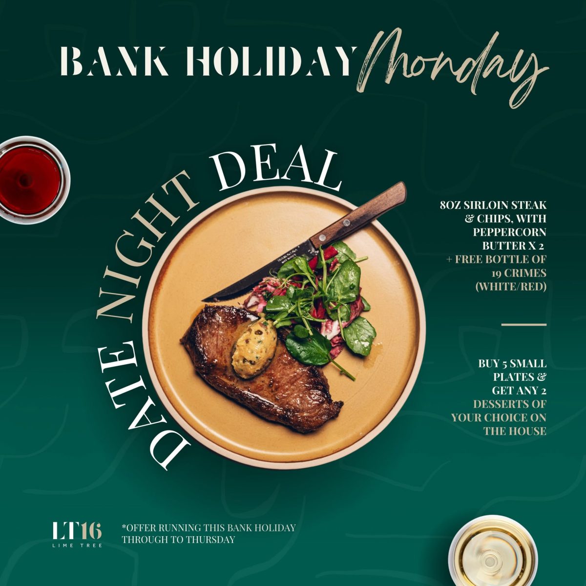
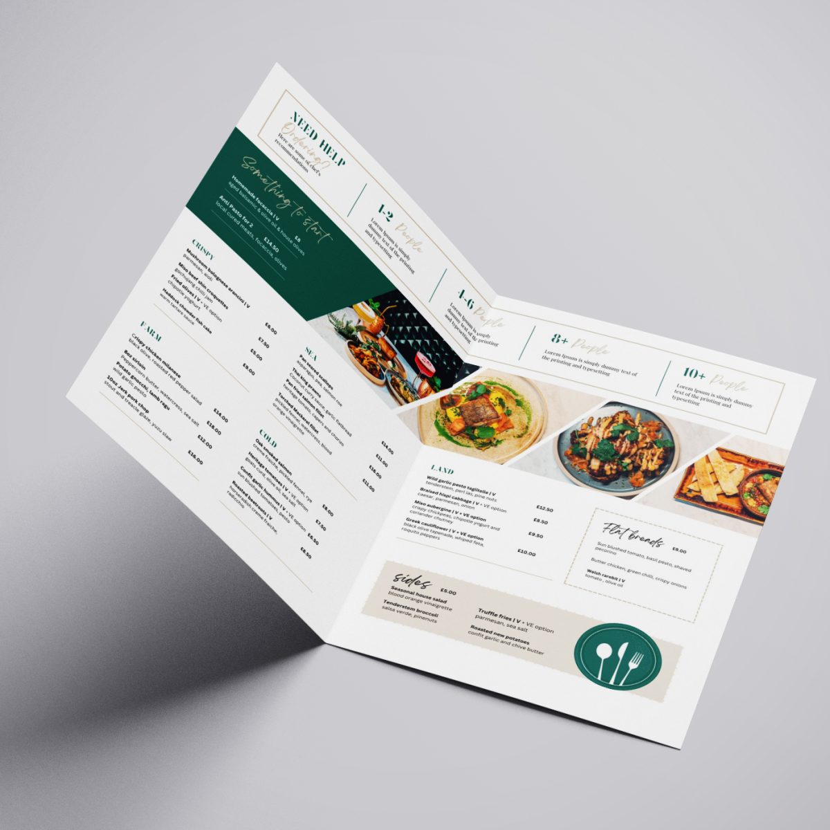
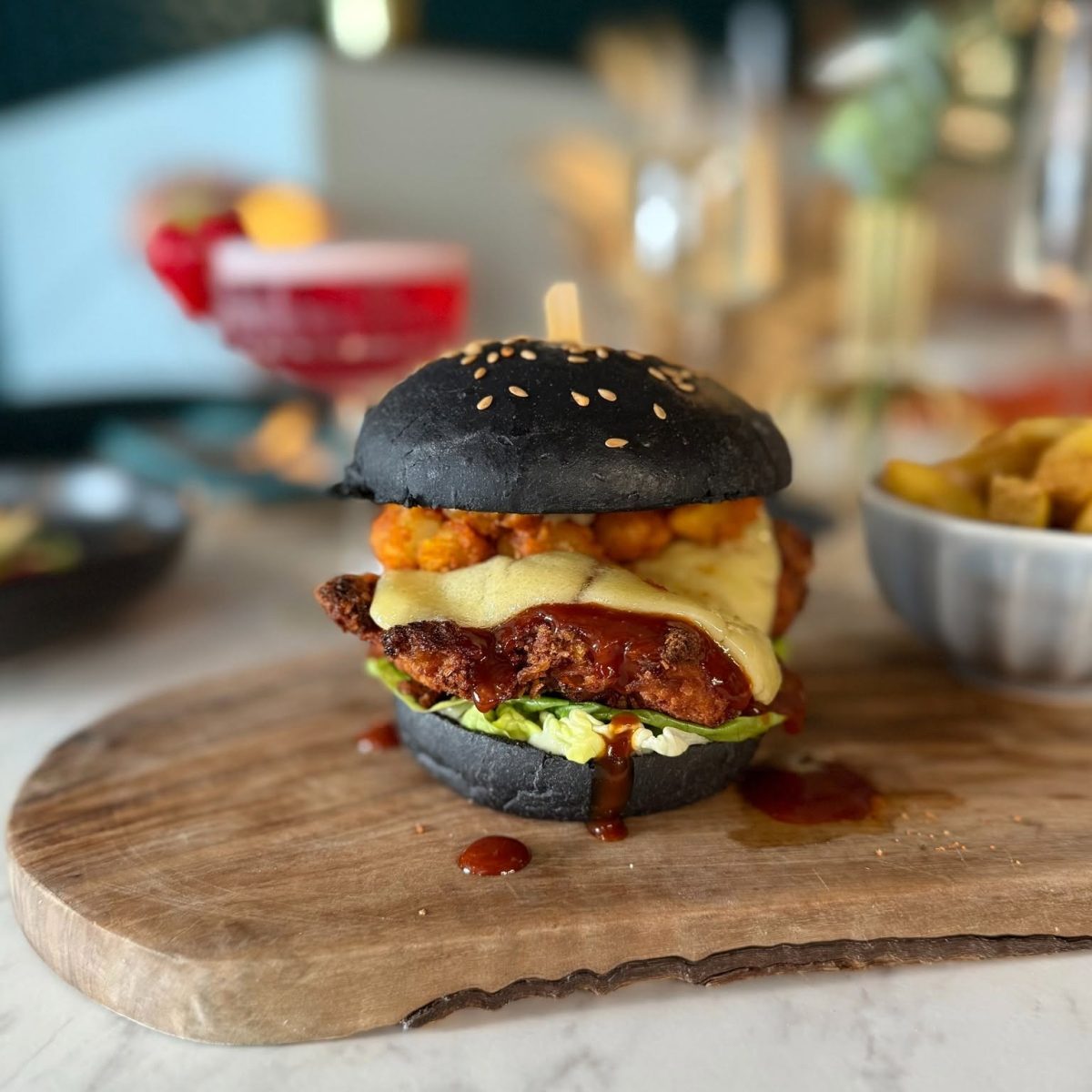
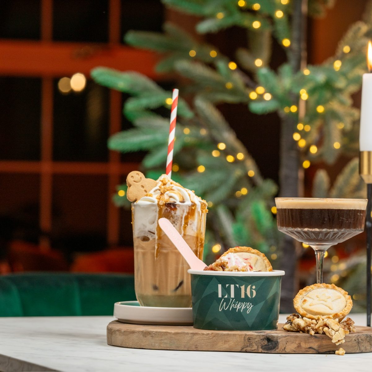
LT16 Restaurant required an ongoing creative and digital marketing partner to elevate its brand, increase customer engagement, and drive bookings throughout the year. The objective was to create a consistent, premium brand experience while supporting regular menu launches, seasonal campaigns, and promotional events across both digital and print.
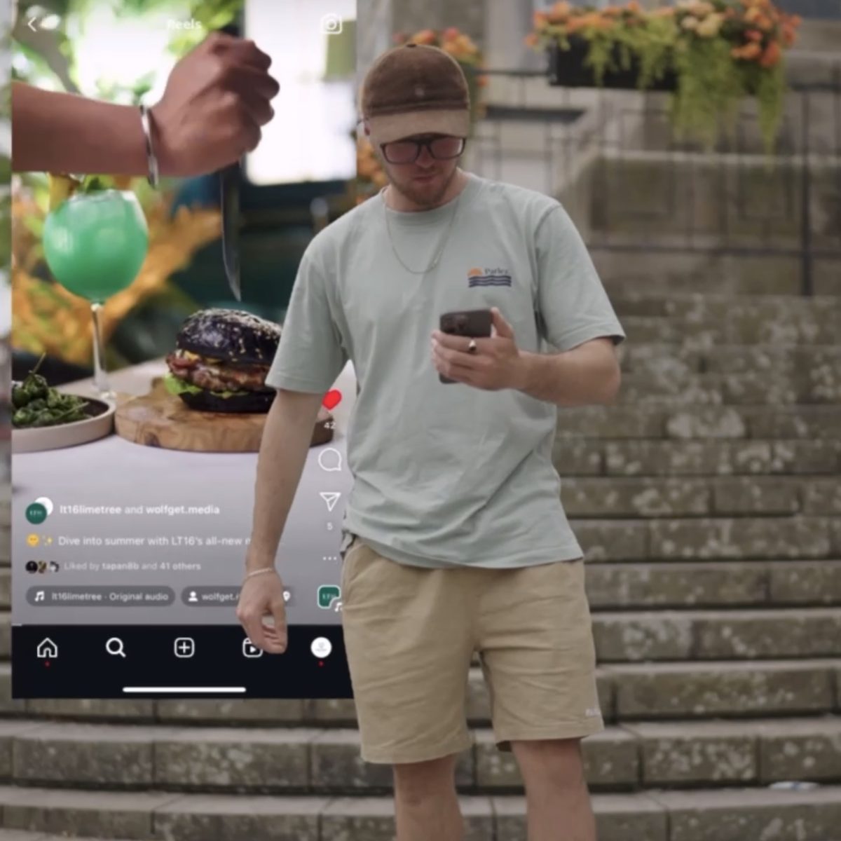
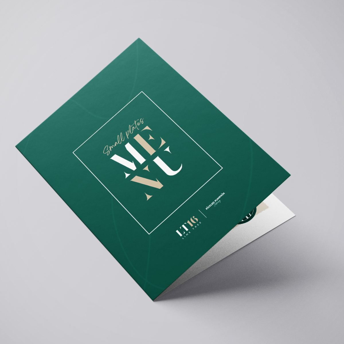
We provided a comprehensive marketing solution, managing the evolution of the LT16 brand through refreshed brand guidelines, logo development, and ongoing website management, including the creation of new landing pages and campaign content. We designed all food and drinks menus, campaign artwork, and in-venue branding while producing continuous social media content through professional photography, videography, and creative design. Alongside organic marketing, we managed targeted Meta advertising campaigns, optimised their Google Business Profile to improve local visibility, coordinated influencer collaborations, and oversaw photo and video shoots to ensure every piece of content reflected the restaurant’s premium dining experience.
The Results
The Optical People gained a polished and consistent social media presence that better reflected the premium experience offered within the practice. Through strategic content creation, professional photography and videography, and the successful promotion of their Cartier Showcase Day, the practice increased engagement, strengthened its brand identity, and created high-quality marketing assets that continue to support its ongoing digital presence.